 |
| Warning Alert! Long post below!!!! |
I was really looking forward for this particular product to be launched since I read the blog post from Rouge Deluxe around October. I finally get my hand on it around early December! YAY! Even though it is not come in a set like in Japan. The pouch is all I want, tbh! LOL! I mean, how come on can resist this cute fluffy kitty pouch! :3
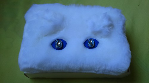 |
| Fluffy white fur with fascinating blue rhinestone eyes! |
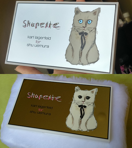 |
| Reflective cover! Both taken with natural lighting but different angles. It is so reflective, almost mirror-like. |
This palette was release a month later than other products from this collection. So it is such a dream item of mine! It comes in a beautiful glittery pink box which is still nice and simple, and the palette itself has reflective cover with the drawings of Choupette on top of it which is drewn by Karl Lagerfeld himself.
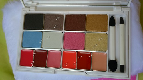 |
| It comes with a dual ended chips and lip brushes, also the plastic cover has cute cat paws prints on it. |
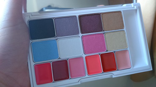 |
| Better look of the color, with the same natural lighting, just different angle. |
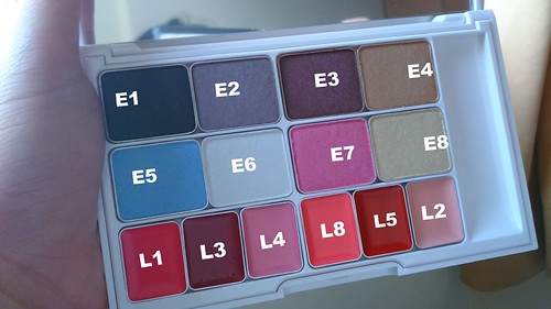 |
| The naming of the lip colors is kind of all over the place. I would appreciate it more if the numbering of the eyeshadow is grouped not by row but the cool side and warm side. |
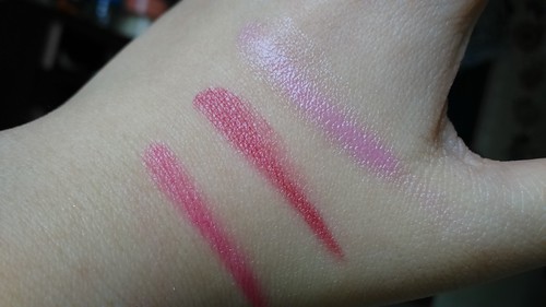 |
| Left to Right: L1, L3,L4 |
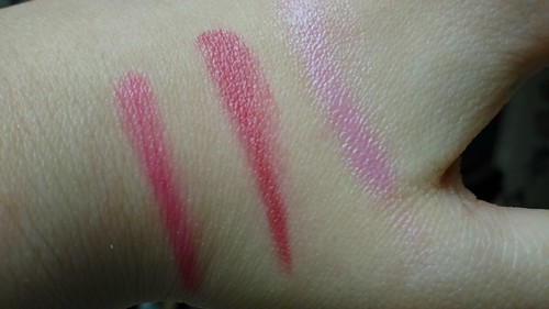 |
| Different angle. Left to Right: L1, L3, L4 |
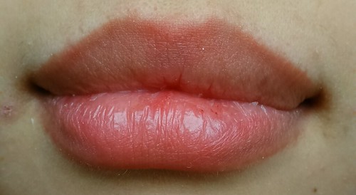 |
| Sorry for the flaky dry lips. I have exfoliated my lips beforehand but well, I was still feeling a bit sick so yeah, it is kinda gross. Once again, I'm so sorry. |
So first of all, I will review the L1 color. It is a cool tone hot pink color. The consistency is so emollient and gives the juicy healthy look. Even though it is emollient, it looks even and do not need to build up so much to get the even opaque color. You definitely need a good lip brush to even out the edge but you can also just using your finger carefully. I use only my finger. This color is the best performance compared to other 5 shades in this palette. It is moisturizing, easy to apply, and does not move around too much.
Next is L3. It is a cool toned red, almost pink or berry like color. It is so flattering in terms of color but the consistency is quite a disappointment. The texture is quite thin and too emollient. It is difficult to stay in place and also to build up the color. It is possible to make the color even but it needs patience since it is prone to sink into lines. It is also prones to feathering, thus lip liner is a must. I found it best to apply it with a wide lip brush even though it still needs patience. It is such a gorgeous color though, my favorite colorwise.
The last shade of the cool tone family in the palette, L4! This is such a pale lavender color. It is so pretty and swatched beautifully on hand. But on lips? Meh... It is so pale, with that emollient consistency compared to my textured and kind of pigmented lips? Not a pretty combination. I think for people with pale lips, this would look so beautiful. Actually, the consistency is not the worst in this palette, but because the color is so light, it makes the appearance worse. Best applied using finger and it stays quite well even though staying power or longetivity is an easy guess. Not gonna stay for too long! That's obvious.
Next, the lip colors from warm tone family: L8, L5, L2. I usually love warm colors more, but surprisingly I love this warm shades less compared to the cool shades. Just like before, I will show you the hand swatches before one-by-one review and lip swatches:
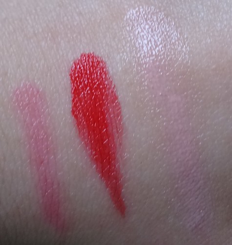
The first lip color I will review from the warm tone family in this palette is L8. It is an almost neon pink colar color. It is not so opaque but have a good opacity. It can sinks into lines but not so noticeable unless you see it really close. To be honest, I thought this would be my favorite color since it is my go to color. But well, the other one might win my heart just because it performs better.
The second color in the warm tone family, L5, is a warm, almost orangey, red color. It leans toward neutral tone though. Depending on the lighting, it might look more orange than red. Even though it is red and have emollient consistency. It does not move too much and does not feather as well on me. Although, you still need a help of lip brush with red color like this.
The last color, and honestly, the worst performing in the palette, L2. I think paler lips could work this color better, but the consistency. OMG! It is the worst. It does not build up color, even on hand swatch (I work so hard to make it noticeable on my hand). It is not just because of the color almost the same with my skin, but it is the problem with the consistency as well. It is so thin. In order to make this review, I have made quite a dent on this particular shade.
Unto the eyeshadows! They are also devided by cool toned and warm toned shades with 4 shades on each part. You can create a whole cool tone or warm tone eye look and you can combine the two together as well. The first one is the cool tone "quad" which swatches can be seen below:
So, for the review, I will talk about E1 first. It is a black satin, almost matte color with silver and blue micro shimmer in it. It is not the blackest black, it looked almost grey. It is quite pigmented, soft and blend easily. It stays on really nice as well. I wore it once on my crease combined with other eyeshadows from another palette. I usually do my make up really early in the morning and return home after work quite late. While other colors had creased and faded like crazy, this still hold quite well. I did wear primer underneath that day, but I also tried wear it without primer and it still holds pretty good. The primer I usually wear is Too Faced Shadow Insurance.
The second color, E2 is a taupe color with satin towards shimmery finish. On the pan it looks more greyish and purple-ish, but on the picture it looked more brown. It depends on the lighting, again. This one is not really pigmented, just so-so. You can build it up with no difficulty though. It is a bit powdery on the pan and sometimes it is difficult to stick on the lid, especially if you have drier lids. It is so pretty though, especially on darker base, especially black.
Then, the third color of the cool tone family in the palette, E5. This color is described as Shupette's Blue, which is inspired by the eyes color of Choupette. This is a very cool tone pastel, pale blue, that looked almost like purple-ish, lilac color, but it is definitely blue. This is so unique and beautiful, definitely one of the reasons why I bought this palette. Unfortunately, it is more on the sheer side and a bit powdery, but just a little. It is a satin finish towards shimmery but not too much. You can build this color and it stays on quite well, especially if you have primer underneath. With darker based, like black or dark green, it appears a bit differently and is really beautiful.
The last one from the cool tone quad, E6. If you look into the pan, it appears almost white, but actually, it is a very cool tone and very pale grey color. It is very brightening, especially for inner corner highlight. It blends easily as well, even though it is quite sheer. It is not as sheer as the white in last year holiday palette though. You definitely can build this color up. I really love this color. This one also looked so pretty on darker based.
Next is the warm tone quad. The cool tone quad is quite glam, even though you can tone it down, or used to create smokey eyes. On the other hand, this quad is more neutral colors with pop of color which is the pink. I have swatches of the warm tone colors below:
Let's talk about the darkest one out of the four, E3. It is such a gorgeous coppery burgundy color. In the picture, it looks more copper than burgundy, as well as when blended out. In the pan and if packed on, it looks more burgundy. It is the softest, and most pigmented out of all eyeshadows in this palette, although not as soft as the one included in last year holiday collection. It is also such a versatile color. Even though it is satin/shimmery, it still looked so good on the crease. The wear time is also quite long.
I do not know how exactly to describe E4 color. One thing for sure, it is such a beautiful color. I would say this is more like a pastel orange-y gold shimmer color. Again, this type of colro is right up my alley. It is so soft and smoothly applied as well. So gorgeous as natural color.
Then, the pop of color of the quad! E7 is a pink color. Applied once, it is pigmented but not really bold. It is such a sweet pastel pink color. If it is packed on, it would become much brighter, which is so pretty. It is soft, applied smoothly, and easy to build the color. It stays on quite well and much better compared to last year's holiday collection.
The last one, E8, is a pale yellow shimmer gold color. It is pretty and really pops although sheer. You have to pack it on. It applies smoothly though. It appears much better on darker color. Compared to last year's holiday collection, this is such an improvement.
I have told you that some colors works well on dark base. I have some swatches over dark base as well, so if you curious on how it looks, here are some swatches. The first one is over black base. I used Sariayu Trend Warna 2012 Etnika Nusa Tenggara Eyeliner in Black. The taupe color shows the brown quality in it and the blue looks more purply, albeit subtle.
Second, I used dark green as a based. I used Estee Lauder Double Wear Stay in Place Eye Pencil in Forest. The blue color looked even more blue and the taupe accentuate the grey color more. The pale grey color looked almost like silver and the gold color looked like an antique olive gold color.
Verdict:
(+):
→ A nice deal, the price is high as expected from a high end brand. But, considering of how much you get, it is a nice deal indeed.
→ Eyeshadow quality is quite consistent.
→ A nice grouping of warm and cool tone color help user to decide what look they will make.
→ Compact, easy to travel with.
→ Cute packaging and cute pouch of course.
(-):
→ Lip color is too emollient and some color does not work really well.
→ Even though the overall quality is good, compared to three special eyeshadow released in last year's holiday collection, it is quite a let down since nothing with that formula released in this palette. As far as I know, that formula also does not come in the singles of the permanent line as well. :(
It is a limited edition and might be hard to get. You can find it in big department store that has Shu Uemura counter though, you can just ask. I recommend the one in Seibu Grand Indonesia since they are usually the store with most stock available. The palette costs 1.480.000 IDR which is quite expensive but it is a limited edition with good quality. I believe you won't be disappointed.
Thank you for reading! I hope this could help you to decide! In case you happen to buy this palette as well, I hope you can have fun playing with it!
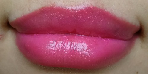 |
| L1 - lip swatch I really like this color, surprisingly. It brightens the whole look. This one also does not accentuate my lips texture. |
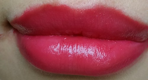 |
| L3 - lip swatch My favorite shade, but consistency is meh! Do you notice the feathering around my lips? |
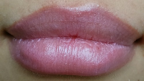 |
| L4 - lip swatch You can see it does not really show up on my lips. It is uneven and accentuate the texture. On pale lips, it would be better though |
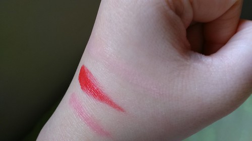 |
| Top to bottom: L2, L5, L8 |
 |
| Left to Right: L8, L5, L2 |
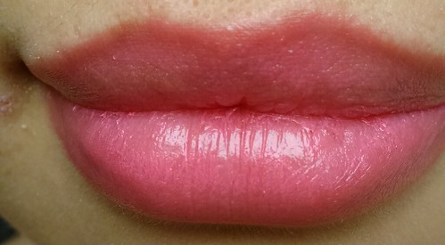 |
| L8 - lip swatch It is not really that opaque, but it is not terrible as well. This one is on the 'okay' level and the color does not wow me either. |
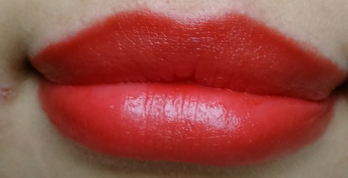 |
| L5 - lip swatch It is not too messy, considering this as red color. It looks a bit orangey, but different angle/lighting might show differently. |
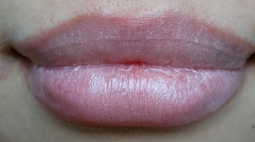 |
| L2 - Lip Swatch This is almost 4-5 layers. So horrble looking. Sinks into lines so bad. I am not a fan! :( |
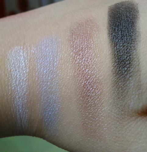 |
| Left to right: E6, E5, E2, E1 The numbering of the swatches kinda all over the place. I swatch the starting from the palest to the darkest color. |
The second color, E2 is a taupe color with satin towards shimmery finish. On the pan it looks more greyish and purple-ish, but on the picture it looked more brown. It depends on the lighting, again. This one is not really pigmented, just so-so. You can build it up with no difficulty though. It is a bit powdery on the pan and sometimes it is difficult to stick on the lid, especially if you have drier lids. It is so pretty though, especially on darker base, especially black.
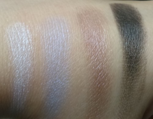 |
| Left to right: E6, E5, E2, E1 Close up swatches. |
The last one from the cool tone quad, E6. If you look into the pan, it appears almost white, but actually, it is a very cool tone and very pale grey color. It is very brightening, especially for inner corner highlight. It blends easily as well, even though it is quite sheer. It is not as sheer as the white in last year holiday palette though. You definitely can build this color up. I really love this color. This one also looked so pretty on darker based.
***
Next is the warm tone quad. The cool tone quad is quite glam, even though you can tone it down, or used to create smokey eyes. On the other hand, this quad is more neutral colors with pop of color which is the pink. I have swatches of the warm tone colors below:
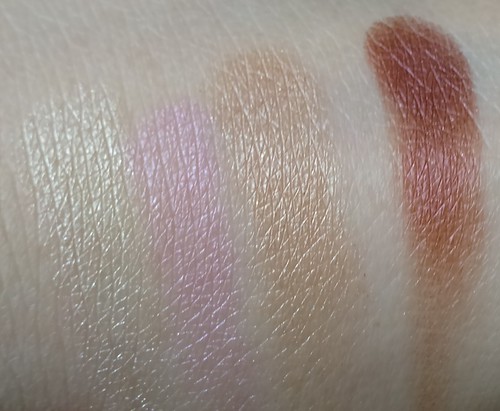 |
| Left to right: E8, E7, E4, E3 The numbering of the swatches kinda all over the place. I swatch the starting from the palest to the darkest color |
I do not know how exactly to describe E4 color. One thing for sure, it is such a beautiful color. I would say this is more like a pastel orange-y gold shimmer color. Again, this type of colro is right up my alley. It is so soft and smoothly applied as well. So gorgeous as natural color.
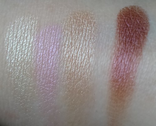 |
| Left to right: E8, E7, E4, E3 Same lighting but different angle. |
The last one, E8, is a pale yellow shimmer gold color. It is pretty and really pops although sheer. You have to pack it on. It applies smoothly though. It appears much better on darker color. Compared to last year's holiday collection, this is such an improvement.
I have told you that some colors works well on dark base. I have some swatches over dark base as well, so if you curious on how it looks, here are some swatches. The first one is over black base. I used Sariayu Trend Warna 2012 Etnika Nusa Tenggara Eyeliner in Black. The taupe color shows the brown quality in it and the blue looks more purply, albeit subtle.
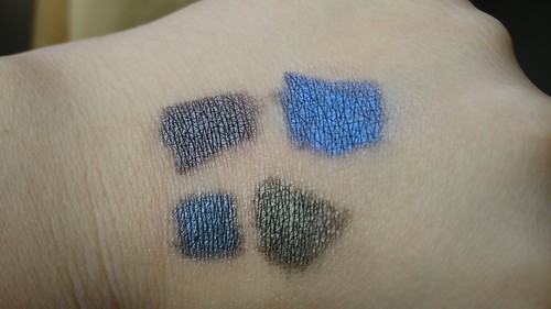 |
| Top: E2, E5 Bottom: E6, E8 |
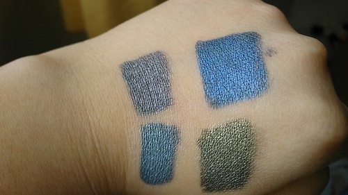 |
| Top: E2, E5 Bottom: E6, E8 |
Verdict:
(+):
→ A nice deal, the price is high as expected from a high end brand. But, considering of how much you get, it is a nice deal indeed.
→ Eyeshadow quality is quite consistent.
→ A nice grouping of warm and cool tone color help user to decide what look they will make.
→ Compact, easy to travel with.
→ Cute packaging and cute pouch of course.
(-):
→ Lip color is too emollient and some color does not work really well.
→ Even though the overall quality is good, compared to three special eyeshadow released in last year's holiday collection, it is quite a let down since nothing with that formula released in this palette. As far as I know, that formula also does not come in the singles of the permanent line as well. :(
It is a limited edition and might be hard to get. You can find it in big department store that has Shu Uemura counter though, you can just ask. I recommend the one in Seibu Grand Indonesia since they are usually the store with most stock available. The palette costs 1.480.000 IDR which is quite expensive but it is a limited edition with good quality. I believe you won't be disappointed.
Thank you for reading! I hope this could help you to decide! In case you happen to buy this palette as well, I hope you can have fun playing with it!
No comments:
Post a Comment